BRANDING CASE STUDY

Branding the international trance duo VINI VICI: an evolution that ends with hands in the air

VINI VICI – electronic music (trance) duo
Branding and digital
(Branding By Omri Azran)
vinivicimusic.com ←
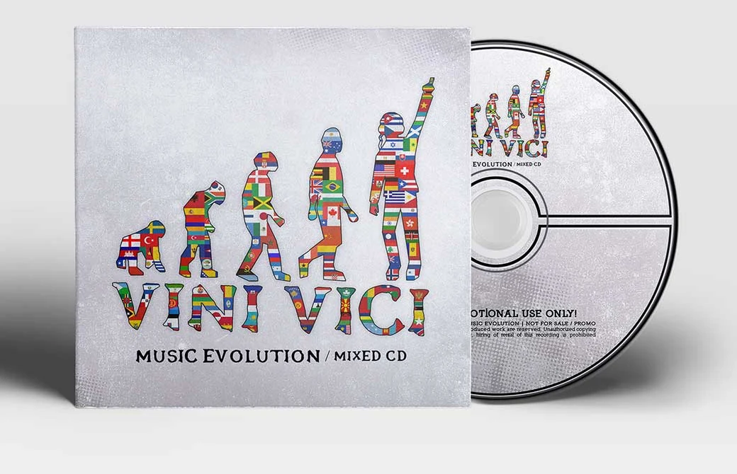
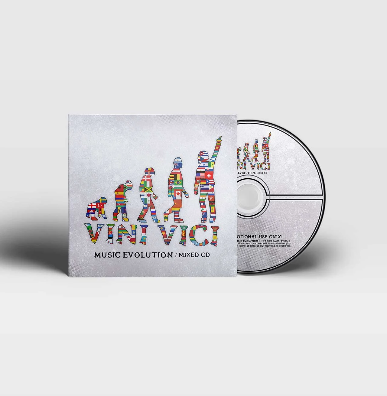
VINI VICI Music Evolution CD cover with evolution figures filled with the flags of the world

01. The storyA duo that conquered the global trance scene

VINI VICI hardly needs an introduction for anyone in Israel who loves electronic music. Matan and Aviram’s duo conquered the global trance scene, won several DJ Mag awards, and still manages to surprise every time.

The brief: to give a brand that was born in Israel and plays to audiences all over the world a single visual identity: striking, memorable, and working everywhere the duo meets its fans, from a CD cover to the screen.

02. The ideaWeeks of work on every detail

The project grew out of a relationship of many years. Omri Azran has known Matan and Aviram for a long time, and in the period before VINI VICI he designed graphics for their earlier act, Sesto Sento.

One day Matan came with the idea and concept for VINI VICI. That began weeks of joint work on every small and large detail, until the identity we see today took shape. The closeness between designer and artists made it possible to fine-tune a brand that feels like theirs rather than a template.

03. The symbolFrom a crawling ape to a person with a hand in the air

The central symbol is a series of figures evolving from an ape walking on all fours to an upright person with headphones and an arm raised to the sky. Beneath it VINI VICI is set in rough lettering that looks engraved. The image tells a story of evolution: music becoming a global culture, and in the end one person on stage with a hand in the air.

The white VINI VICI logo - evolution figures from an ape to a person with a hand in the air

The white VINI VICI logo on a dark background: a sharp monochrome mark that works on any surface.

04. The visual worldThe symbol in different guises: flags, concrete and illustration

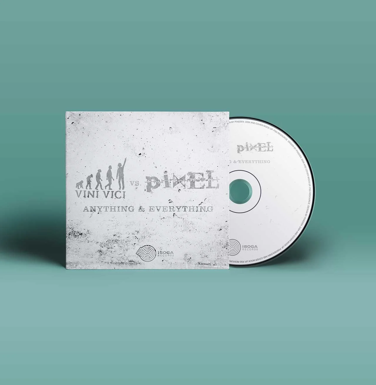
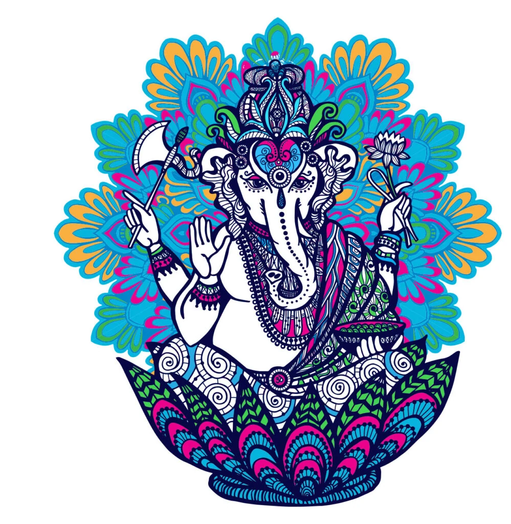
A strong symbol has to survive changes of colour and material. In the colour version every figure is filled with the flags of many countries, a nod to the duo’s global audience. In another version the logo appears in soft silver on a light concrete background. Alongside them, a colourful mandala-style illustration widens the visual world beyond the logo.

The line that accompanies the project says it all: THE BEAT JUST GOES STRAIGHT ON ON. Branding for music should feel like a beat: clear, continuous and contagious.
The result in the field
To the official VINI VICI website ←

How do you build branding for a music act or an artist?

Branding an artist starts with a concept rather than a logo. In the VINI VICI project the idea came from the artists, and a symbol was built around it that tells a story of evolution, from an ape to a person with a hand in the air. Such a symbol has to be simple enough to work as monochrome and strong enough to survive changes of colour and material, so it has a white version on a dark background, a colour version with national flags and a silver version on concrete. After the symbol come the applications, such as CD covers, illustrations and video. More branding work is in the portfolio.

Close work with the client is part of the story. Here the designer had known the artists for years and was a partner in work that lasted weeks over every detail. If you are an artist, creator or business that wants a brand identity, you can start with a conversation with the team, estimate the cost in the calculator and continue to website development. Another professional branding example is an accounting firm in Haifa.

// FAQ

Frequently asked questions

Who designed the VINI VICI branding?
The branding was designed by Omri Azran (Branding By Omri Azran), who had known Matan and Aviram for years and designed graphics for their earlier act, Sesto Sento. After Matan presented the VINI VICI concept they worked together for weeks on every detail.
What is the idea behind the VINI VICI symbol?
The symbol is a series of figures evolving from an ape walking on all fours to an upright person with headphones and a raised arm. It tells a story of evolution: music becoming a global culture, ending with one person on stage. The symbol exists in a white version, a colour version with national flags and a silver version on a concrete background.
Which applications were built around the branding?
CD covers, such as Music Evolution / Mixed CD and the Anything & Everything cover shared with Pixel, a colourful mandala illustration and video clips from the shows.

Want a brand identity that stays in memory?

We build complete brand identities for businesses, artists and creators, from the symbol to the website and system, in Israel and abroad.