
Insurance Agency Branding: From an Existing Logo to a Complete Identity
How to turn a good logo into a full design language - colors, typography, icons, a website design system and a brand book - without changing a single line of it.
01. The ChallengeA Strong Logo With No Language Around It
The insurance industry is full of visual clichés: umbrellas over families, stock-photo handshakes, and corporate blue chosen only because "insurance is blue". Ayelet Insurance & Finance had an advantage most agencies lack - an original, strong logo: an L and A monogram in a blue gradient. But there was no language around it: the website, social media and documents each looked different.
The Mission: build a complete brand identity from the existing logo, without changing a single line of it - so that every touchpoint, from the business card to the website, feels like the same professional agency and the same advisor you can trust.
02. Symbol AnalysisThree Shapes Hidden in the Logo
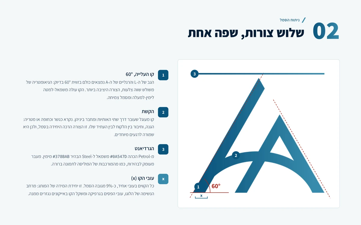
Before choosing a single color, we measured the logo. It turned out that every diagonal line in the symbol sits at exactly 60° - the geometry of an equilateral triangle, the most stable shape. The two letters are joined by an arc that reads as a bridge or an umbrella: protection and connection. And everything is colored in a gradient moving from deep blue to light blue, from depth to clarity.
These three elements, together with the symbol's uniform stroke width (which became the brand's unit of measure), are the foundation of the entire graphic language. Nothing in the identity was invented from outside - everything is derived from the logo.
03. Brand StrategySecurity, Clarity, Growth
We defined three values, in a fixed order of priority, against which every design and copy decision is tested. Each value has a direct anchor in the symbol, so the strategy and the design tell the same story.
Security
The stable triangle of the A, the deep blues, and heavy, steady headlines.
Clarity
The dark-to-light gradient, plenty of white space, and copy that explains complex things simply.
Growth
The L's ascent line rising at 60°, and the "forward" arrow that recurs across the interface.
The verbal voice comes from the values too: we write like an advisor who knows the client by name - warm, direct and precise. No exclamation marks, no "special offers", no pressure.
04. Logo VersionsOne Logo, Eight Versions
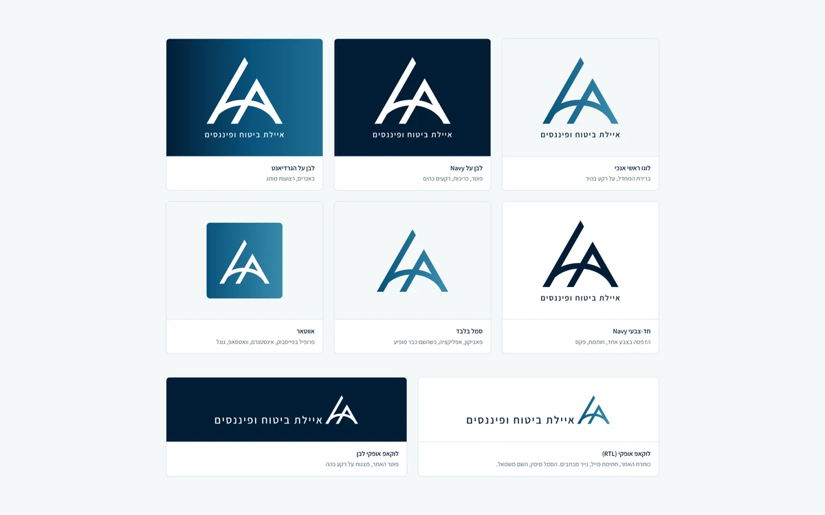
From the original file we derived a complete version system, without redrawing the logo: a primary vertical logo, a horizontal lockup adapted for right-to-left layouts, a symbol-only mark, white versions for dark backgrounds, a single-color version for one-color printing, and a social media avatar. Each version has defined clear space, a minimum size and a list of misuses.
05. The Color PaletteThe Blues of the Symbol
The colors weren't picked from a chart - they were sampled directly from the logo: three tones from the gradient and a deep Navy from the name. Around them we built light, blue-tinted surfaces, website status colors and a dark theme. Every text and background pairing was tested and meets WCAG 2.1 AA, so the brand is readable for everyone.
06. TypographyOne Typeface, a Hierarchy of Weights
The name in the logo is set in a geometric monoline sans, so we chose Assistant as the brand's only typeface. Hierarchy comes from weight and size rather than switching fonts: 800 for headlines, 600 for subheadings, 400 for text. The result is consistent, loads fast on the website, and feels familiar to Israeli audiences.
07. Graphic Language & IconsLine, Arc and Transition
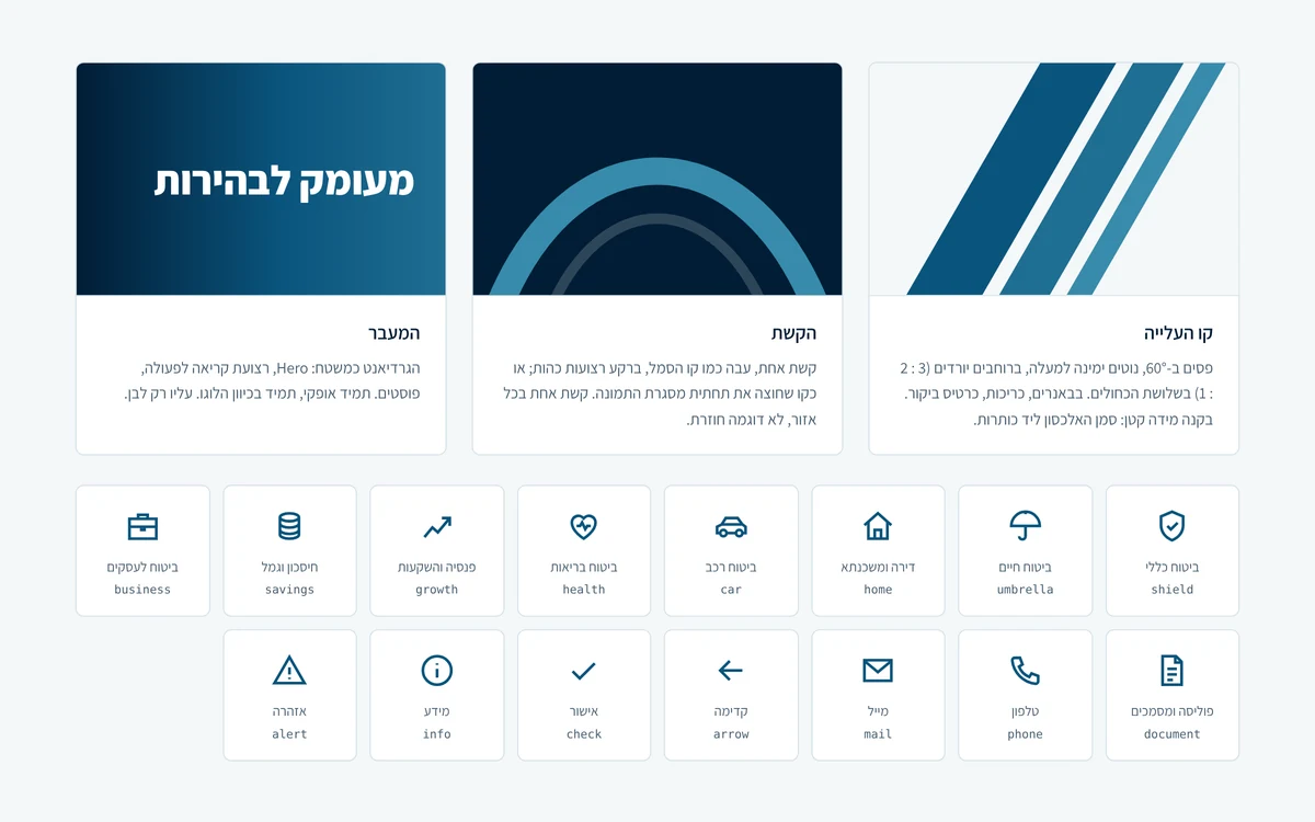
The symbol's three elements became graphic devices: the ascent line - 60° bands in the three blues for banners and covers; the arc - a thick line behind dark bands and across photo frames; and the transition - the gradient as a surface for brand moments. We also designed a set of 15 original line icons - health, life, car, home, pension, savings and more - with straight, angular ends, just like the symbol.
08. Website Design SystemFrom Brand to Code
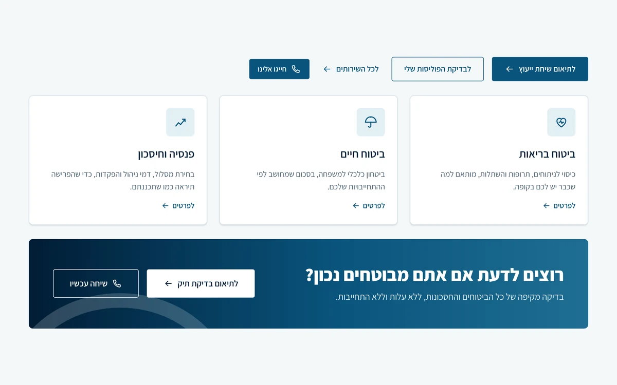
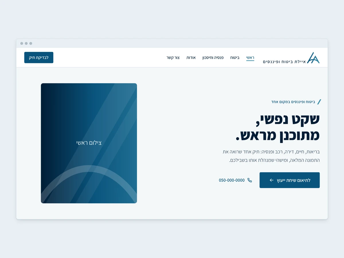
A brand that lives only in a PDF doesn't help a website. So we translated the brand into a complete design system: color, typography, spacing and corner tokens as CSS variables, light and dark themes, and nine ready-made interface components - buttons, form fields, service cards, notices, a call-to-action band, a header and a footer.
Every component is built right-to-left, with visible keyboard focus and contrast that meets Israeli Standard 5568. Ayelet's new website is built from exactly the same building blocks, and every future page will look like part of the same family.
09. Real-World Applications
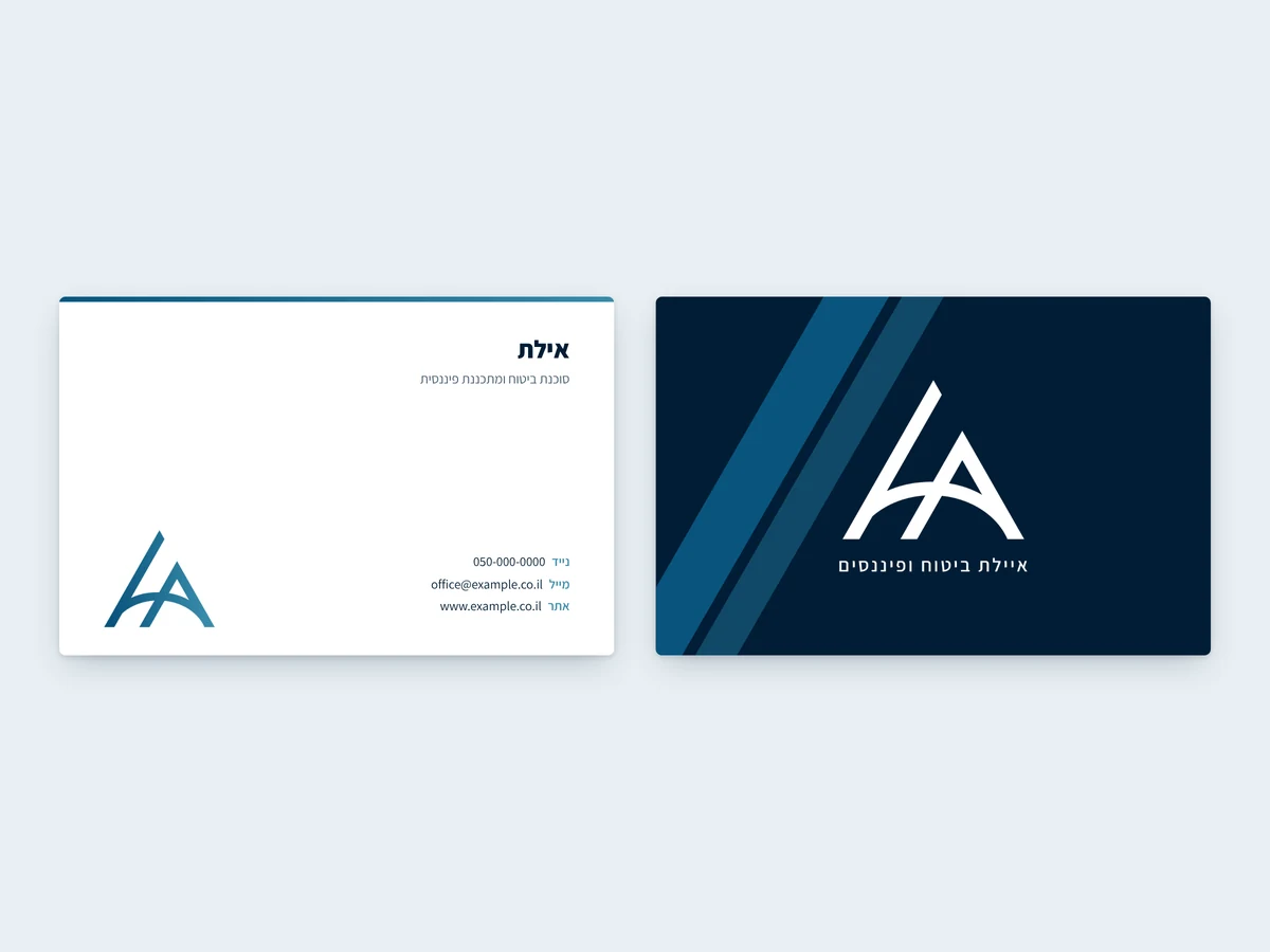
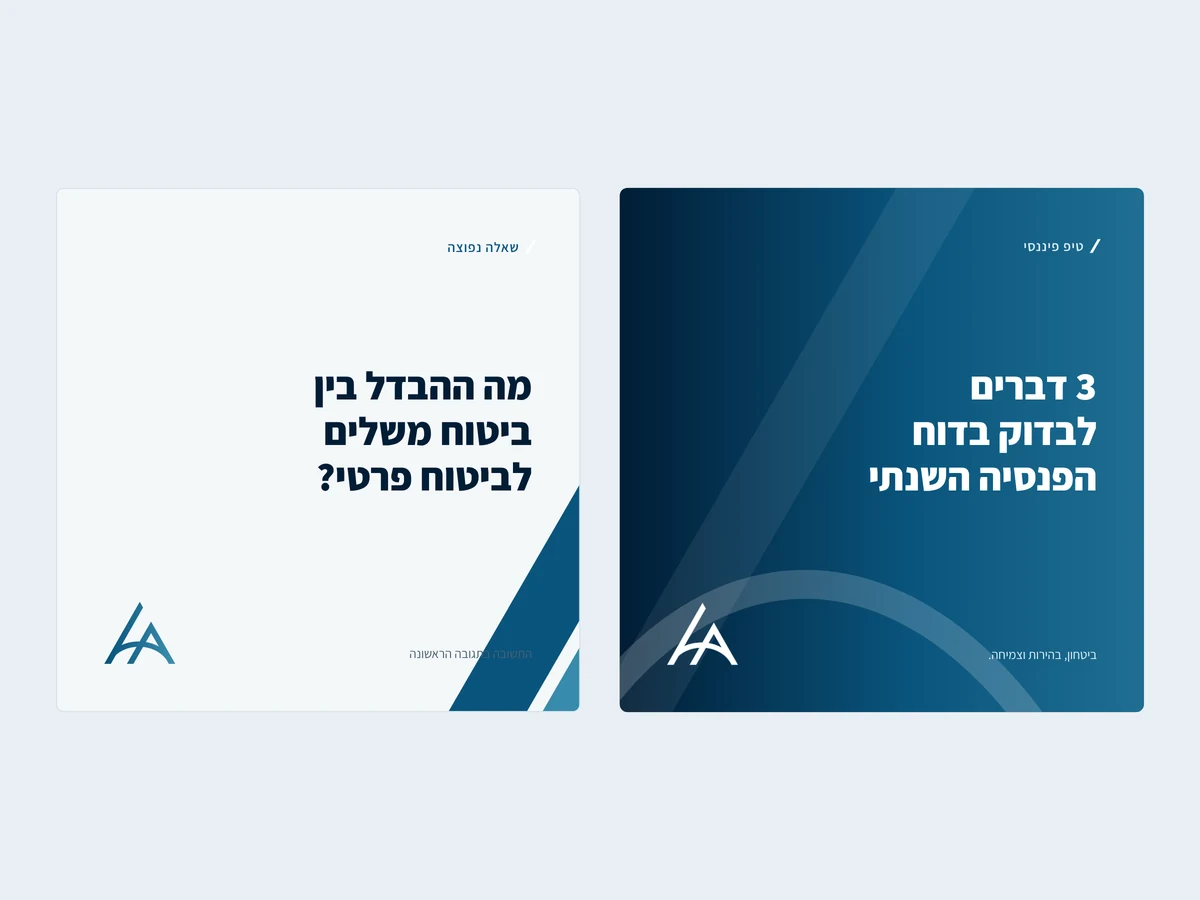
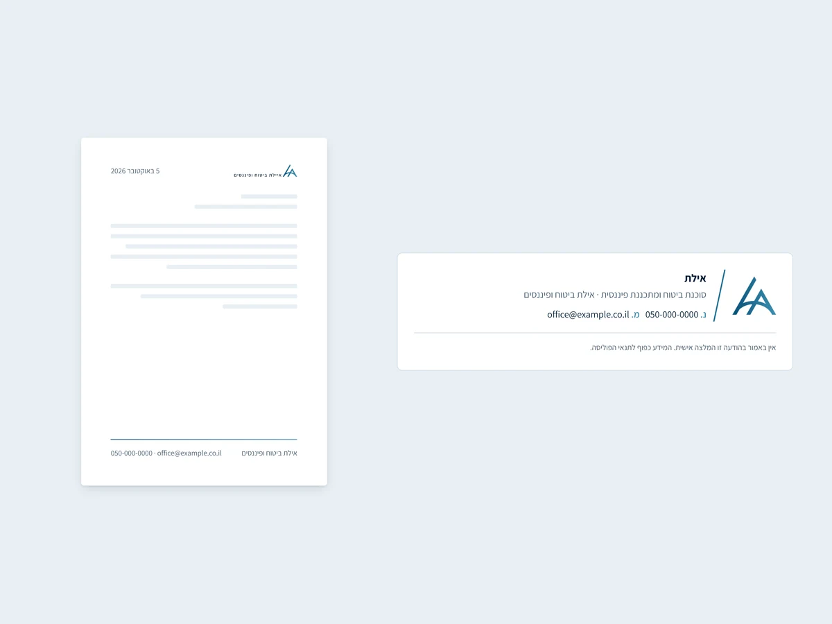
The brand moves from screen to business card, email signature, social media and website - and stays consistent in each.
Good branding doesn't always start from a blank page. Sometimes all the answers are already in the logo - you just need to measure it, understand what it says, and turn it into a language you can speak everywhere.View the website built on this brand →
Insurance Agency Branding FAQ
What does a branding process for an insurance agency include?
A full branding process includes analysis of the logo and brand, defining values and verbal voice, a color palette, typography, a graphic language, icons, a logo version system, applications such as business cards and social templates, and a brand book that brings all the rules together. For Ayelet Insurance & Finance we also built a website design system.
Can you build a complete brand without replacing the logo?
Yes. When the logo is good, it's better to build around it than to replace it. In this project we didn't change a single line of the logo: we derived the colors, angles and shapes from it, and built the entire design language from them.
What's the difference between a brand book and a design system?
A brand book defines how the brand looks and sounds in every channel - print, social media, documents and the website. A design system translates the brand into code: CSS variables, ready-made interface components and accessibility rules, so every page on the site is built from the same building blocks.
Why are the brand colors blue?
We didn't choose blue because "insurance is blue". The blues were sampled directly from the gradient already in the logo, and each tone has a defined role: Navy for text and dark backgrounds, Petrol for actions and links, and Steel for graphics and icons.
How do you make sure the brand is accessible?
Every text and background pairing in the palette was tested and meets WCAG 2.1 AA contrast and Israeli Standard 5568. Statuses are always marked with a word or icon, never color alone, and every website component has visible keyboard focus.