BRANDING CASE STUDY

Rebranding a Criminal Law Firm: From Sketch to Full Identity

Motlak Badran - Criminal & Traffic Lawyer
Branding & Visual Identity Design
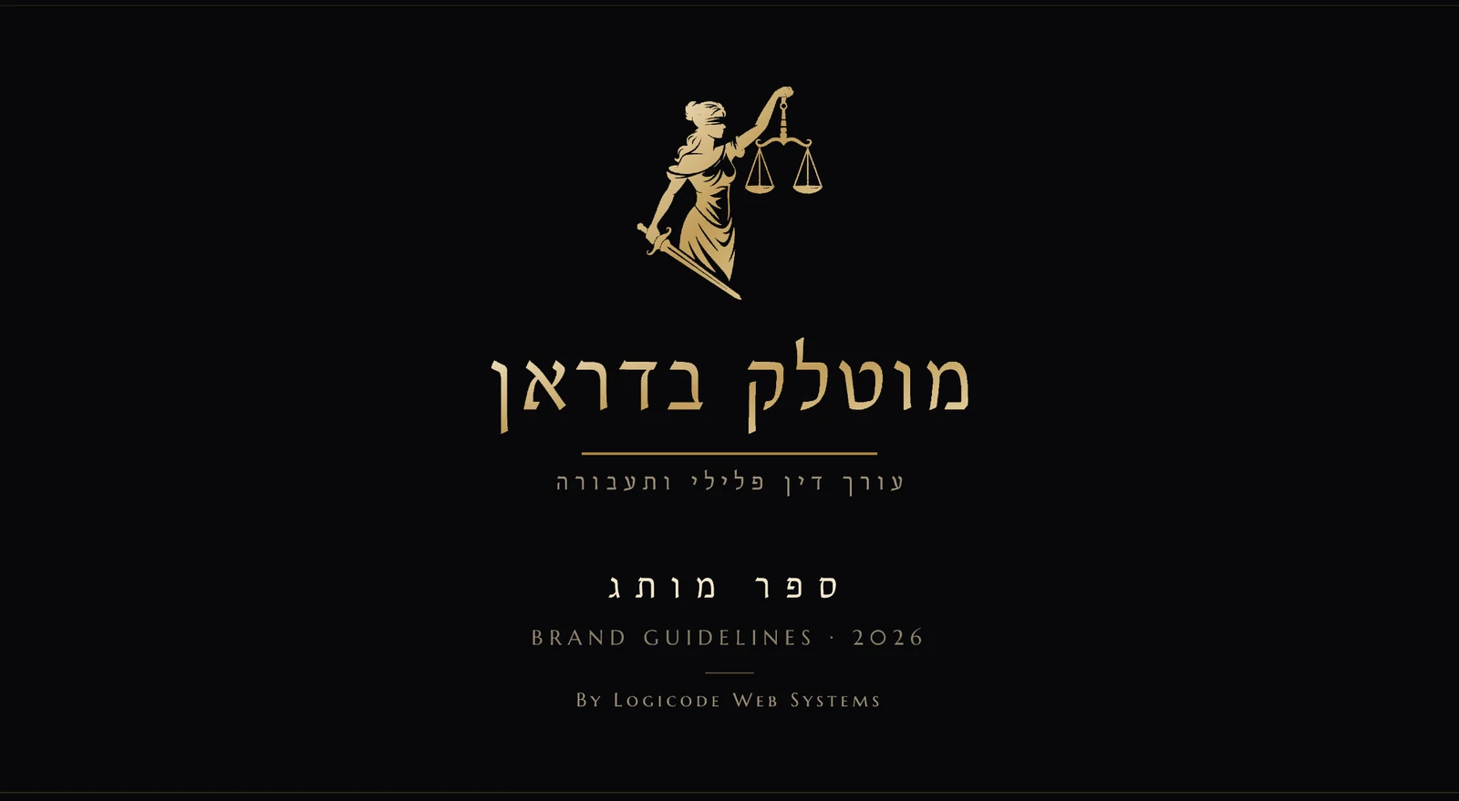
Motlak Badran brand book - criminal defense attorney

01. The ChallengeBreaking Out of the 'Lawyer' Cliché

Search for 'lawyer' on Google and most websites look identical: corporate blue, a generic serif font, and the same stock-photo scales of justice. For attorney Motlak Badran, who represents people at the most complex and sensitive moments of their lives, the existing branding (or lack thereof) simply didn't tell the right story - not the seriousness, not the determination, not the humanity behind the work.

The Mission: build a brand identity that passes two tests at once - looking authoritative and serious enough to reassure a client in distress, and distinctive enough to be remembered and stand apart from every other criminal law office in the region.
02. Design StrategyQuiet Authority, Not Noise

We chose the blindfolded 'Lady Justice' figure - universally recognized as a symbol of law and justice - but re-illustrated her in a delicate, modern gold line, instead of the overused classic statue. The choice of gold against a 'Matte Black' (not glossy black) background was deliberate: black is the quiet foundation, gold is the single point of emphasis - and it never 'dominates' the design.

Every element of the identity was designed to avoid the industry's clichés: no colorful backgrounds, no corporate blue, and no 'cheap' graphic effects (glossy shadows, stock filters). The result is a minimalist, selective identity that speaks quietly - and is stronger precisely because of that.

03. The LogoOne Symbol, Two Language Versions

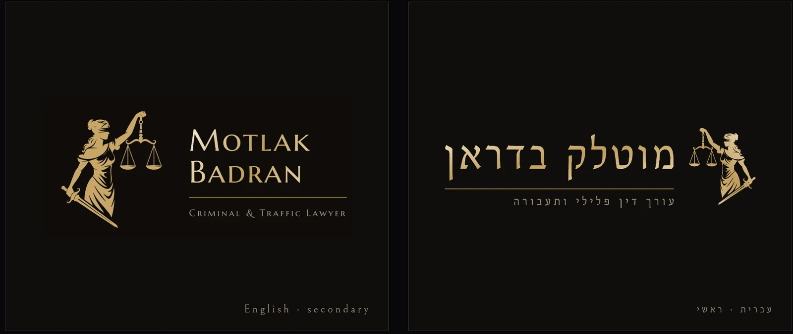
The primary logo pairs the 'Lady Justice' illustration with the firm's Hebrew name in a regal serif typeface, plus a subtitle - 'Criminal & Traffic Lawyer' - that instantly places the specialty. A secondary English version (Motlak Badran - Criminal & Traffic Lawyer) allows consistent use with Arabic- and English-speaking clients across the north.

The main Motlak Badran logo in Hebrew and English

The primary logo: Hebrew version (right) and secondary English version (left), both on a 'Matte Black' background.

04. Brand FlexibilityOne Brand, Every Use Case

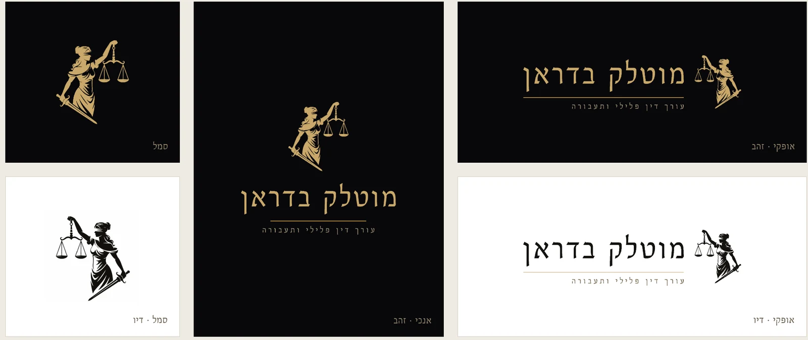
Good branding has to work in every context - on dark and light backgrounds, horizontally and vertically, and even as a symbol-only mark for use as an icon or stamp. We built the firm a complete version system: a standalone gold and black symbol, horizontal and vertical logo lockups, and monochrome (black-and-white) versions for uses like fax, email signatures, or black-and-white printing.

Motlak Badran logo variations - symbol, horizontal, vertical, gold and black-and-white

Six official logo versions, for every need and every background.

05. The Color PaletteQuiet Black, Precise Gold

The color palette was built around one principle: gold is the only point of light against a matte black that never 'shines'. Two gold tones (a darker one for text, a lighter one for emphasis) and a neutral sand/cream shade allow flexibility in designing print materials and official documents without straying from the identity.

Cream
#EFEBE3
Sand
#C6BCA8
Bronze
#A8823C
Gold
#C9A86A
Light Gold
#E4C994
Matte Black
#08080A

06. TypographyThree Fonts, One Role Each

We chose a serif-only type family - no sans-serif - to preserve a sense of tradition and legal gravitas. Each font has a defined role: Bellefair for the logo and Hebrew headlines, Marcellus SC for the English version, and Georgia for every official document (Word files, letters, proposals) to ensure consistent display on any computer.

מוטלק בדראן
Bellefair
Logo & Hebrew headlines
MOTLAK BADRAN
Marcellus SC
Logo & English headlines only
אבגדהוזחטיכלמנסעפצקרשת
Georgia
Word documents, letters & proposals
Good branding doesn't shout - it lets the client know, in a single moment, that they're in the right place. That's exactly the feeling we wanted anyone visiting the site or receiving a Motlak Badran business card to have.
The Impact
View the website built on this brand →

What does branding a criminal law firm involve?

Branding a criminal law firm begins with understanding the audience: a person in distress who is looking for authority, determination and humanity. The decisions follow from that: avoid the field’s clichés, such as corporate blue and stock images of scales, and build a minimalist identity that people remember. For Motlak Badran this means a logo with a "Lady Justice" illustration and the firm name in a serif typeface, in a Hebrew version and a secondary English version, plus a system of six versions that work on dark and light backgrounds, horizontal and vertical, and even as a symbol alone. Everything is documented in a brand book that defines uses and colours for each version, so anyone preparing a document or presentation later keeps the same look. More of our work is in the portfolio.

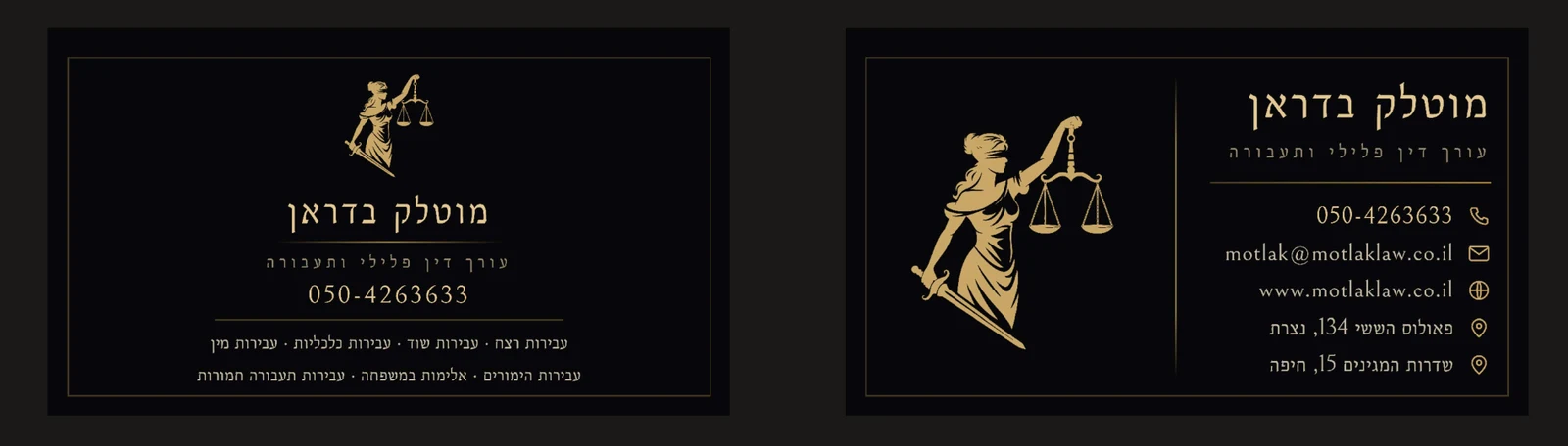
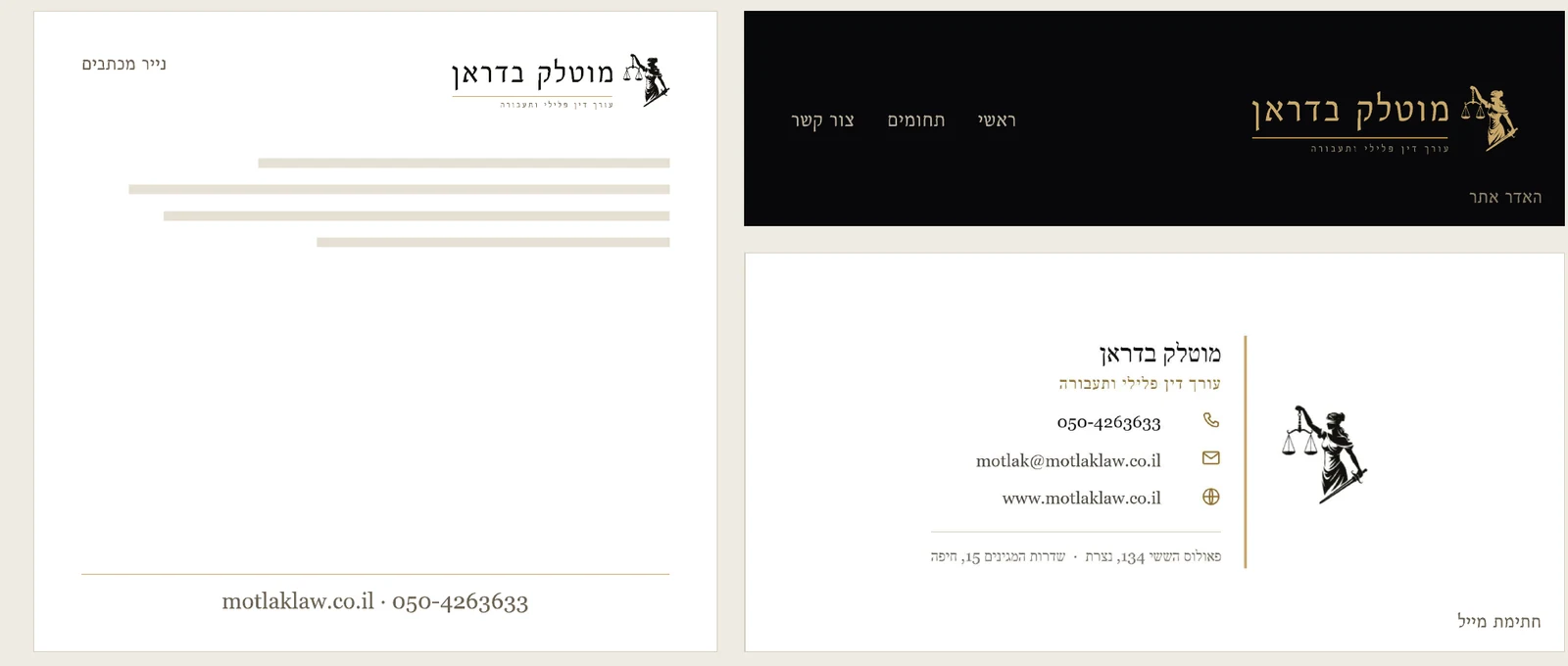
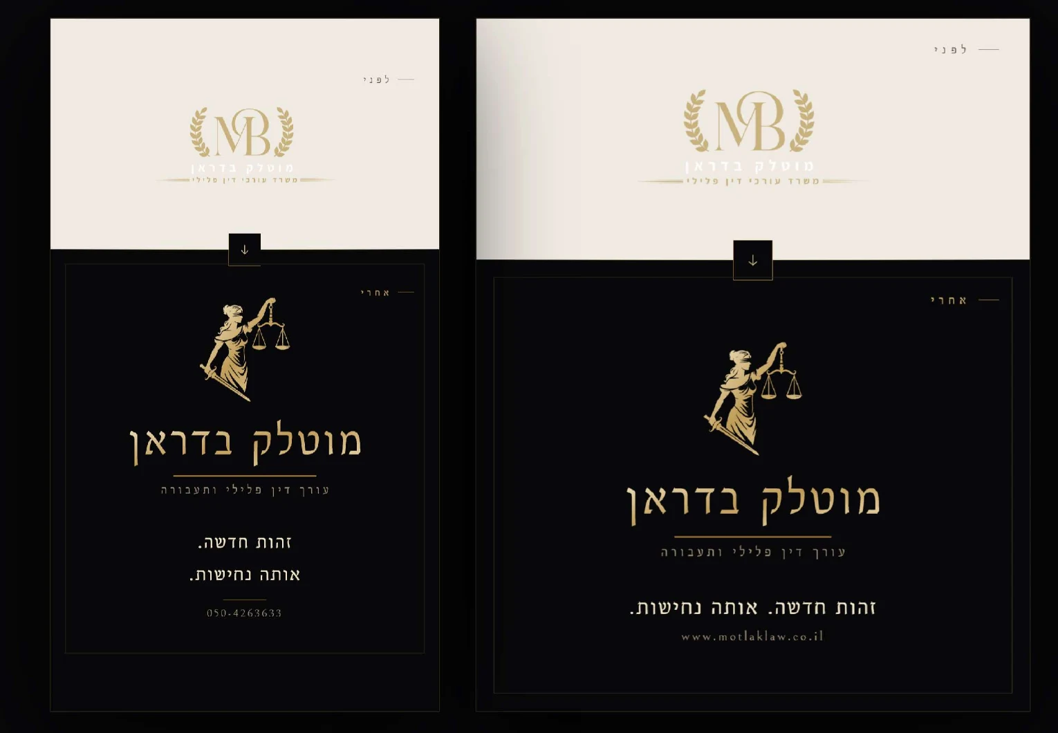
Good branding does not stay on the screen. It moves to a business card with gold Hot Foil on black, to letterhead, to social media and to the website. That is why, after the branding, we also built the lawyer’s website, as described in the trilingual website case study, based on the same identity. If you run a law firm and want a criminal law firm branding or a civil one, it helps to decide up front which applications you need, from business cards to email signatures, and then you can start with a conversation with the team, estimate the cost in the calculator and continue to website development. Another branding project we carried out is Ayelet Insurance and Finance, where the existing logo stayed unchanged and the whole system was derived from it.

// FAQ

Frequently asked questions

What branding was created for Adv. Motlak Badran?
A complete visual identity: a logo with a "Lady Justice" illustration in gold on matte black, six logo versions, a palette of gold and sand, serif typography and applications on Hot Foil business cards, stationery, social media and a website built on the branding.
Which typefaces were chosen, and why only serifs?
Only a serif family was chosen, with no sans-serif, to preserve a sense of tradition and legal gravity. Bellefair is used for the logo and Hebrew headings, Marcellus SC for the English version, and Georgia for Word documents, letters and quotes, so the display stays consistent on every computer.

Does your business need a brand identity that sets you apart from the competition?

We build a complete brand - logo, color palette, typography and applications - and translate it into a website that delivers results.