
Humor Book Branding: From an Illustrated Cover to a Complete Identity
How to turn a topic everyone is embarrassed by into a brand everyone laughs with – voice and tone, a handwritten logo, color, typography, living illustrations, a brand book and a website design system – without losing the line of the cover.
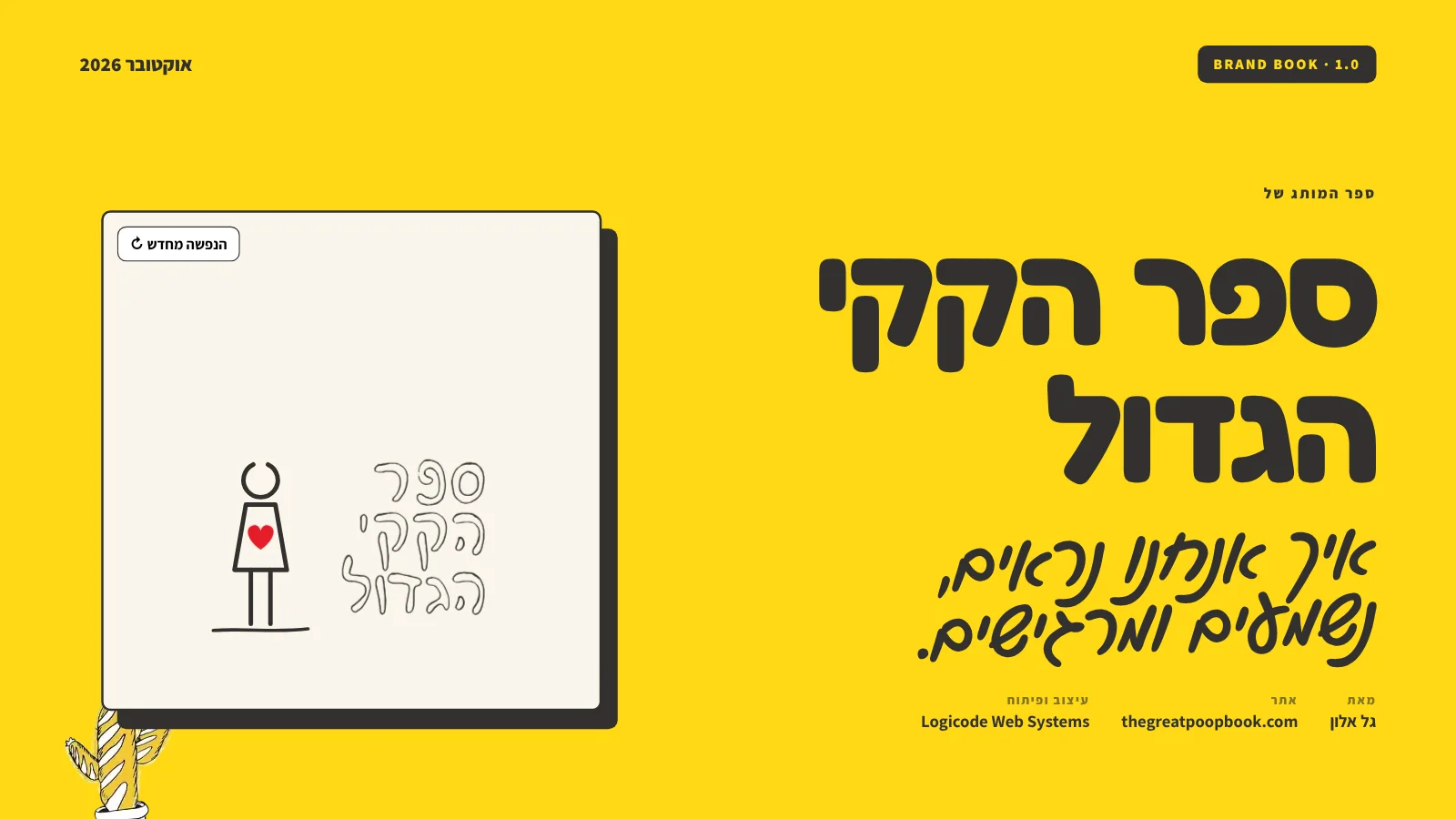
01. The challengeA taboo topic, a strong cover, no language around it
The Great Poop Book is a collection of true, funny stories about the small moments of happiness on the toilet – a best-seller with more than 12,000 copies sold. The book had a cover with character: a handwritten title, an illustrated figure and a red heart, illustrated by Sigalit Carmeli. Outside the cover, though, there was no language. The old website looked like any WordPress store, and the posts, emails and promotions each spoke in a different voice.
The challenge was twofold: build a brand around a subject people blush at – without sliding into crudeness, and without being shy. The brief: translate the cover into a complete brand identity, so every touchpoint – from the website and checkout to the order email and the Instagram post – feels like the same book and the same friend telling an embarrassing story about himself.
02. The essenceShhh… we don't talk about it. So let's talk.
Before choosing a single color, we wrote down what the brand says. Purpose: break the taboo with a smile – talking about poop is almost as liberating as doing it. Promise: a small moment of happiness, instead of checking your phone again. Difference: a gift with a personal touch – every copy can ship with a personal dedication from the author and a designed bookmark.
From this we derived four personality traits that every design and copy decision is tested against:
Cheeky, but warm
We dare to say what everyone thinks – always with a wink, never with a sting.
Honest all the way
True stories, strange places, strange situations. No need to polish them.
Everyday funny
Everyday humor, not stand-up. Smiling, not cringing.
Made by hand
An illustrated line, handwriting and a personal dedication. Nothing feels mass-produced.
The audience: adults 16+, people looking for a funny gift for birthdays and events, and parents looking for the children's potty-training book.
03. Voice and toneWe write the way Gal talks
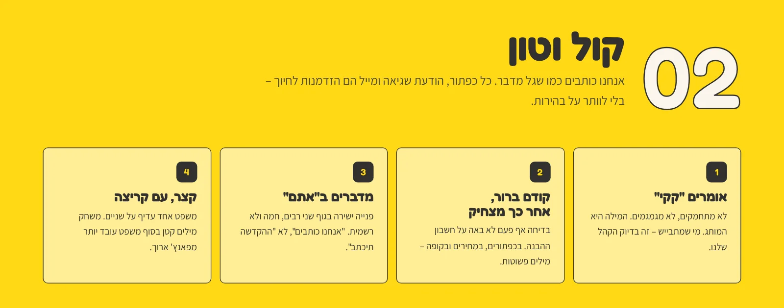
In a humor brand, copy is half the design. We defined four principles: Say "poop" – no euphemisms, the word is the brand. Clear first, funny second – on buttons, prices and checkout, the joke never costs understanding. Talk to "you" – warm, direct, not formal. Short, with a wink – a small pun at the end of a sentence beats a long punchline.
Every screen on the site got copy that follows these rules: the empty cart reads "Your cart is empty… like after a good poop", the 404 page says "Oops, this page got flushed", and the thank-you page says "Thanks, Dana! The poop is on its way". Alongside it we built a vocabulary – what we say (toilet, stall, a gift that makes people laugh) and what we never say ("bowel movement", "click here", an emoji in every sentence).
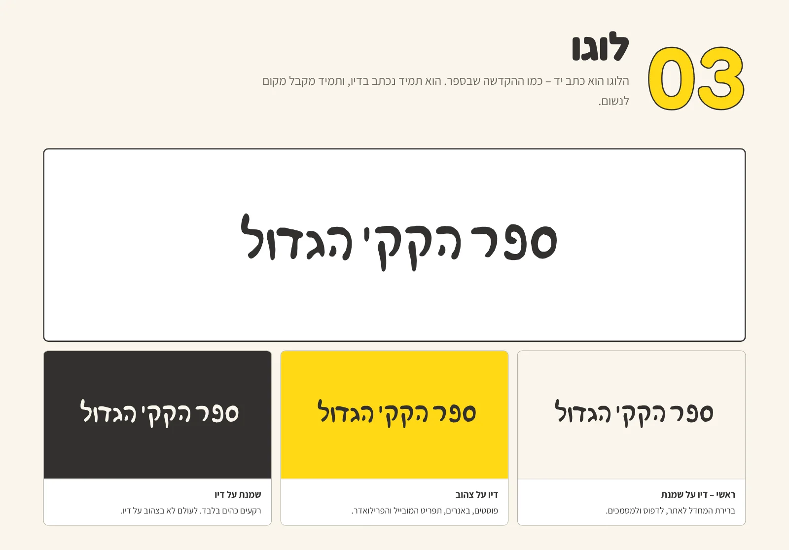
04. The logoHandwritten, like the dedication
The logo is derived from the handwriting on the cover, and it is always set in ink. We created three versions: primary – ink on cream, for the website and print; ink on yellow – for posts, banners and the mobile menu; and cream on ink – for dark backgrounds only. Yellow on ink is never allowed.
We defined clear space of 50% of the logo height, a minimum width of 120px on screen and 30mm in print, a fixed 4.76:1 ratio and a list of misuses. The logo also moves: when the site loads it is "written" line by line (0.45 seconds per line), the figure from the cover draws itself and the heart beats – then the yellow screen opens onto the site.
05. Color paletteSun yellow, ink and paper
The colors weren't picked from a chart – they come from the cover and the world of the book: the sun yellow of the cover, the ink of a pen and cream-colored paper. These three carry the whole brand in a fixed ratio – 50% cream, 25% yellow, 18% ink – and red is reserved for the heart. Around them we defined supporting colors for illustrations, dedications and success messages.
Every text-and-background pair was tested: ink on yellow at 9.4:1 and ink on cream at 12:1 – both AAA – and every secondary color meets at least WCAG 2.1 AA. Each color also has RGB, CMYK and Pantone values for print.
06. TypographyThree families, one job each
We chose three free Google Fonts that support Hebrew: rounded, friendly Fredoka for headlines and prices, clean Assistant for text and UI, and handwritten Gveret Levin – only for personal moments such as the dedication and the bookmark, always one line, never a paragraph. A fixed type scale keeps the website, emails and posts looking like one family.
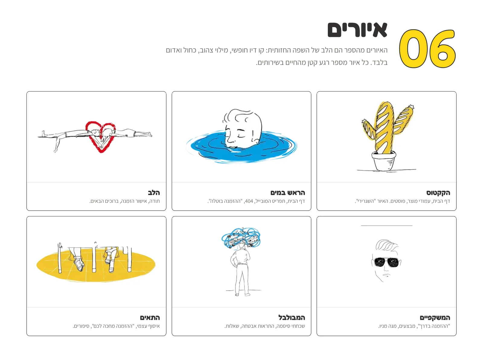
07. IllustrationsSix moments from the book, alive on screen
The book's illustrations are the heart of the visual language: a loose ink line, filled only with yellow, blue and red. We chose six – the heart, the head in the water, the cactus, the stalls, the confused guy and the sunglasses – and gave each a role: the heart for order confirmations, the head in the water for the 404 page and cancelled orders, the cactus for the home and product pages.
On the website the illustrations move: the head bobs in the water, the cactus sways in the wind, and the legs under the stall door on the teaser page tap impatiently. All motion is subtle and stops for visitors who set "reduce motion" on their device.
08. Graphic elementsYellow marker, ink shadow and handwriting
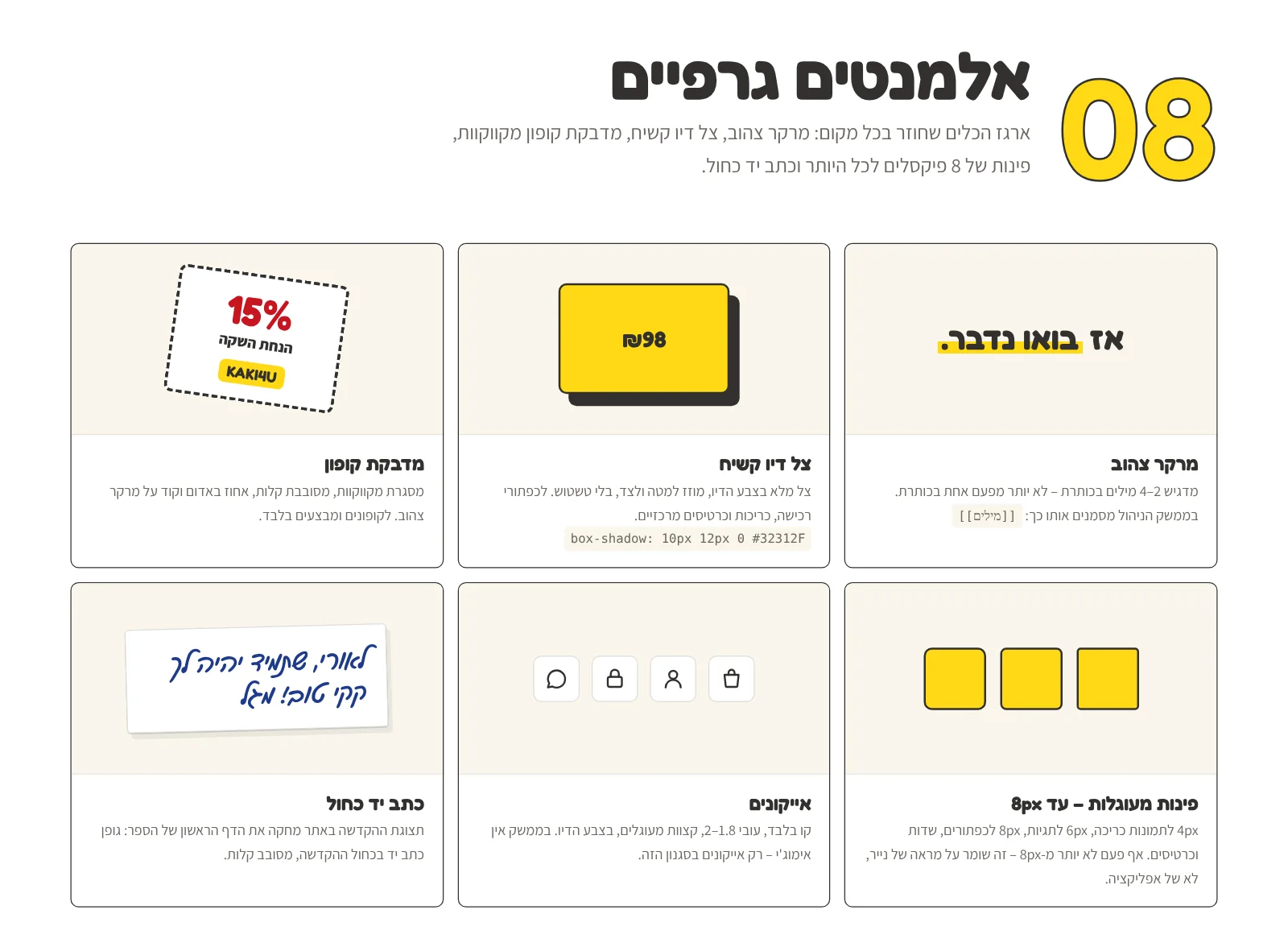
A small toolbox that appears everywhere: a yellow marker highlighting 2–4 words in a headline, a hard ink shadow (10px 12px, no blur) for buttons and cards, a dashed coupon sticker, blue handwriting for dedications, line icons with a 1.8–2 stroke, and corners of 4–8px at most – because a book cover is not an app.
09. Website design systemFrom brand to code
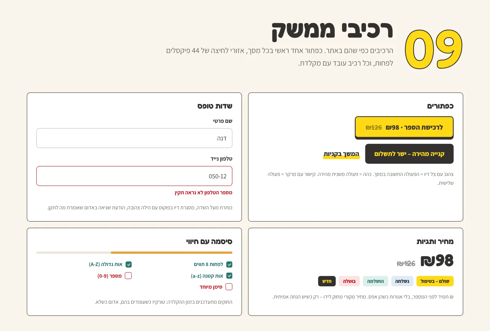
A brand that stays in a PDF doesn't sell books. So we translated the brand into a design system: color, type, spacing and radius tokens as CSS variables, and ready UI components – a yellow primary buy button with an ink shadow, a dark "quick buy" button, form fields with clear error messages, a password strength meter, status tags and prices with a previous price.
Every component was built right-to-left, with touch targets of at least 44px, visible keyboard focus and contrast to Israeli standard 5568. The new Laravel website – store, checkout, customer account, emails and admin panel – was built from the same building blocks.
10. The brand in action
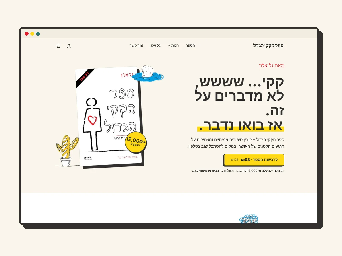
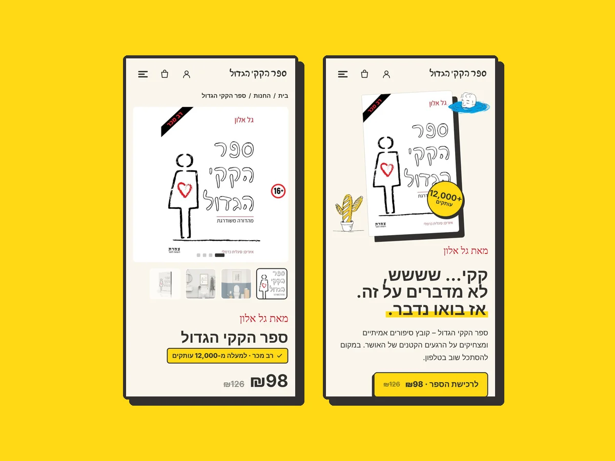
The brand moves from the book to the website, mobile, social media, emails and the launch page – and keeps the same voice and the same line in each.
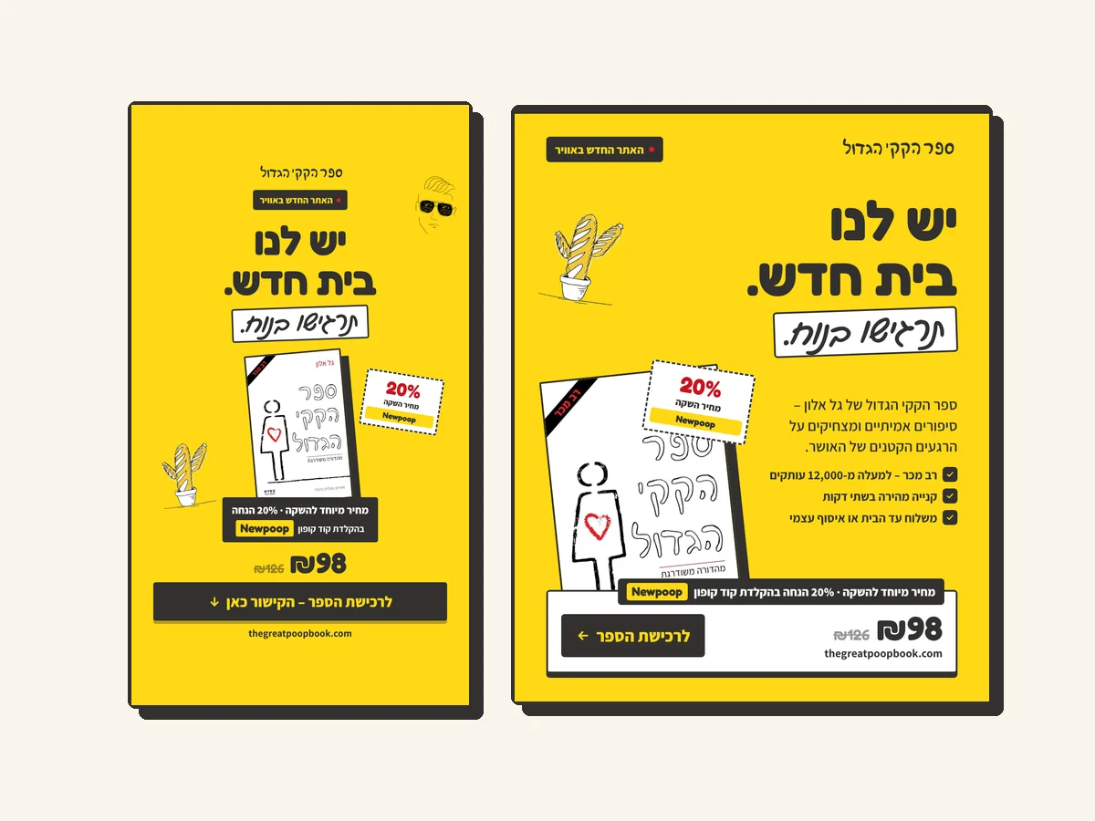
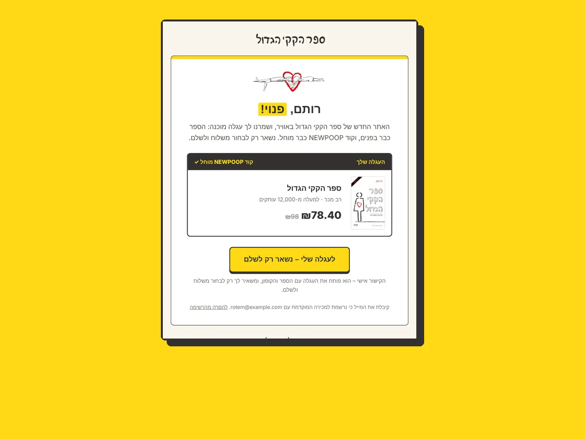
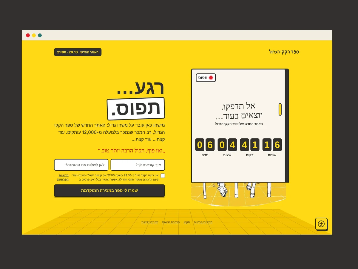
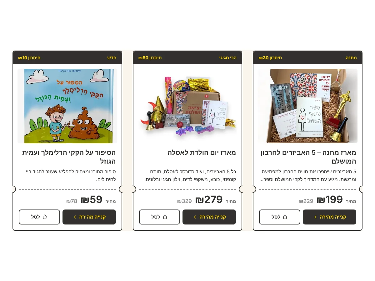
A brand about poop can't be shy. When the voice is honest, the colors are warm and the line looks like a pen in hand, people stop blushing, start laughing – and send the book to their friends.View the website built on this brand →