BRANDING CASE STUDY

Branding an accounting firm: an identity that gives peace of mind and clear numbers

Ruzin-Iluz Ilana – CPA firm, Haifa
Branding, brand book and visual identity
See the platform case study ←
Brand book of Ruzin-Iluz Ilana - an accounting firm in Haifa

01. The challengeSounding like one person, not a file in a drawer

Accounting firms look and sound almost identical: corporate blue, slogans such as "advanced financial solutions" and stock photos of laughing businesspeople. For Ilana Ruzin-Iluz that simply is not true. This is a private firm in Haifa with twenty years of experience in bookkeeping and payroll, where every client deals with one woman who knows their business by name.

The brief: to build an identity that conveys precision and integrity while staying warm and approachable. A brand that looks like a serious professional firm, yet speaks at eye level with freelancers, companies and non-profits in Haifa and the north.
02. The strategyPeace of mind. Clear numbers.

The positioning we defined: "not another file in a drawer, a partner on the business journey". From it came a lead line, "numbers at eye level", and a short statement that runs through every material: peace of mind, clear numbers. Four values hold the brand: precision, clarity, personal availability, and responsibility and integrity.

The voice is part of the identity too. We wrote guidelines that explain how to sound like Ilana: plain language without jargon, concrete rather than slogans, warm without flattery, and careful with facts. Instead of "the tax refund procedure is complex" you write "send us the forms, and within days you will know whether you are owed a refund".

03. The logoTwo pillars, two people, one ii

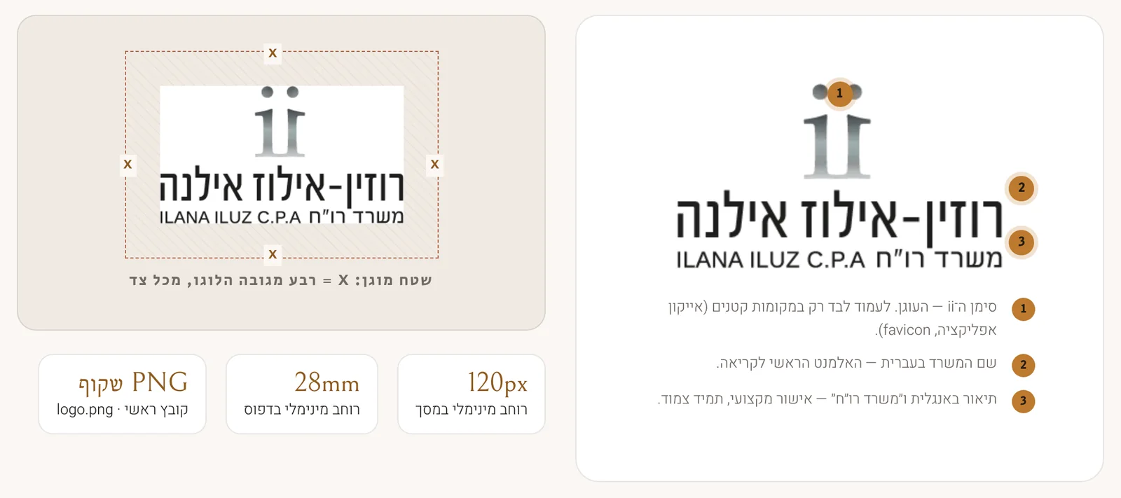
The mark is two pillars, each with a dot above it. It reads as the initials "ii" of the name, and at the same time looks like two people standing together: the accountant and the client. Beneath it the firm name in Hebrew is the main element to read, with an English descriptor and "CPA firm" as a professional endorsement that always appears alongside.

The main Ruzin-Iluz Ilana logo with its parts and clear space labelled

The main logo with its parts labelled (left: clear space of a quarter of the logo height on every side, minimum width 120px on screen and 28mm in print).

04. Brand flexibilityRight use, and forbidden use

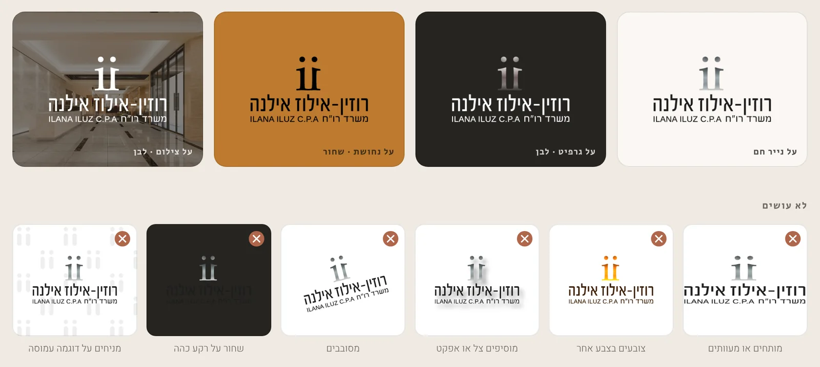
The logo has to work on any background: warm paper, graphite, copper and even photography. Each background has a defined version, in white or black. Alongside it we spelled out what is not allowed: stretching, recolouring, adding shadows, rotating, placing on a busy pattern or showing black on a dark background. That way anyone preparing material a year from now keeps the same identity.

Correct and forbidden uses of the Ruzin-Iluz Ilana logo on different backgrounds

Top: four correct uses. Bottom: six forbidden uses.

05. The colour paletteGraphite, paper and copper

A warm, quiet palette. Graphite and paper carry most of the page, and copper appears in one place on every screen: what you want people to click. We defined usage ratios (roughly 55% paper, 20% sand, 20% graphite and a copper accent), a dark-mode version, and checked every combination against the WCAG accessibility standard. Regular copper suits buttons and large headings, while small text on paper uses deep copper.

Graphite
#262421
Paper
#FAF7F3
Copper
#BD7A2E
Sand
#F0EAE2
Terracotta
#B0664B
Deep copper
#8F5A1E

06. TypographyThree typefaces, three roles

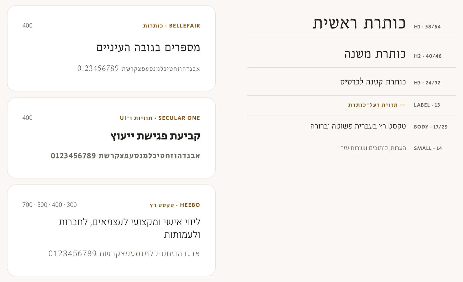
Bellefair for headings, giving numbers and messages an elegant, calm look. Secular One for labels and interface elements such as "book a consultation". Heebo for running text, in four weights, for maximum Hebrew readability. Above all sits a clear hierarchy, from a 58px main heading down to 14px notes.

The typefaces and type hierarchy of the Ruzin-Iluz Ilana identity - Bellefair, Secular One and Heebo

The three typefaces and the type hierarchy, from main heading to notes.

07. Pattern, icons and photographyThe ii pattern and a warm visual language

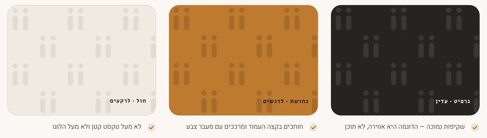
The logo shape becomes a quiet pattern for backgrounds, covers and posts: a circle above a pillar, in pairs, in graphite, copper or sand. It is atmosphere rather than content, so it is kept at low opacity and never placed over small text or over the logo itself.

The icons share one language: a uniform thin line, rounded ends and a round badge in translucent terracotta, for every service the firm offers, from tax refunds to payroll. For photography we chose warm light and real people, Ilana and her clients, instead of stock images, floating charts and coins.

The Ruzin-Iluz Ilana ii pattern in graphite, copper and sand

The ii pattern in three tones: graphite for subtlety, copper for accents and sand for backgrounds.

An accountant's brand does not need to impress, it needs to reassure. When a client meets the logo, the card or the website, they should feel the same thing: here is someone who understands the numbers and speaks to them at eye level.
The result in the field
See the website and platform built on the branding ←

What does branding an accounting firm involve?

An accounting firm sells trust rather than a product, so branding has to convey precision, integrity and warmth at the same time. The process starts with positioning: who the clients are, what the firm promises and how to say it. For Ruzin-Iluz Ilana the positioning is "a partner on the business journey", with the line "numbers at eye level". From it come a logo (the ii mark with the firm name in Hebrew and English), a colour palette with usage ratios and an accessibility check, three typefaces, icons in one line language, a graphic pattern and rules for photography and writing. Everything is collected in a brand book that defines what is allowed and what is not, so anyone preparing material a year later keeps the same look. More of our work is in the portfolio.

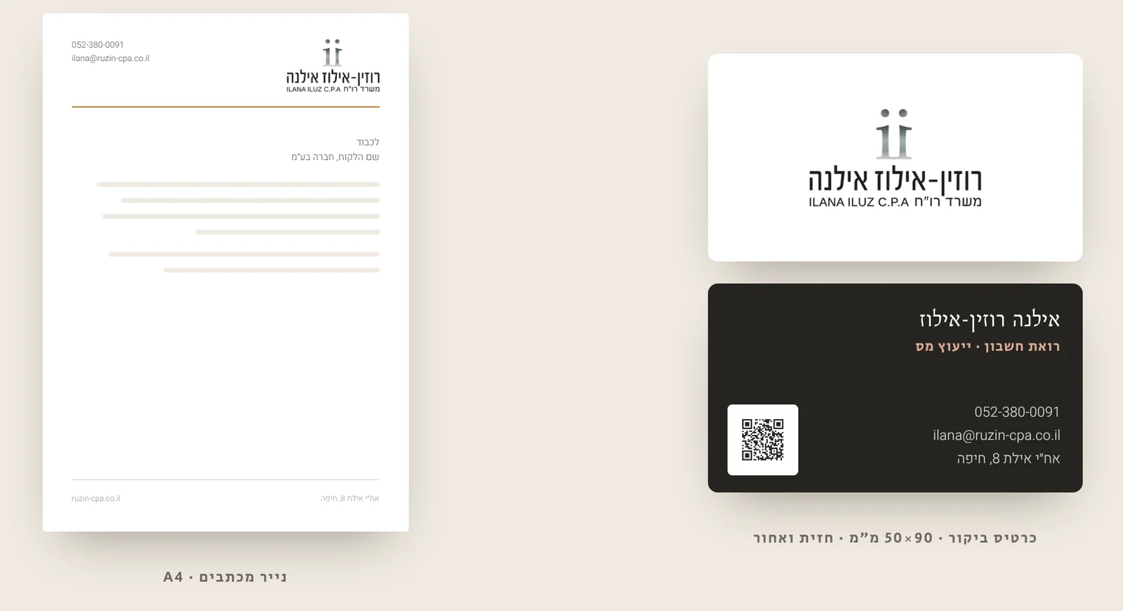
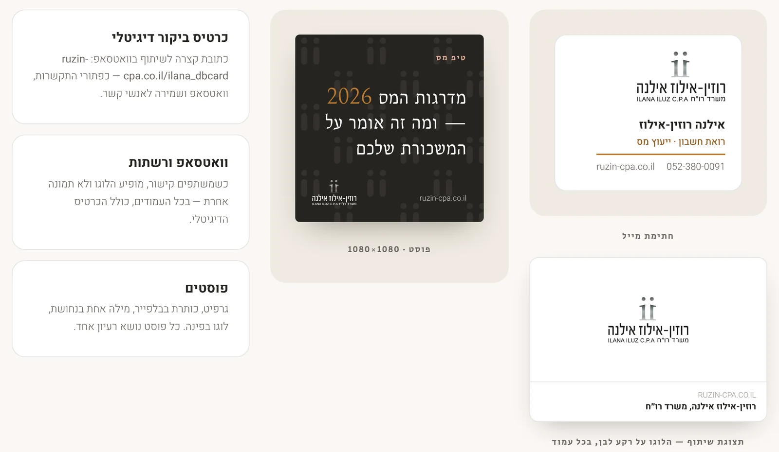
Good branding does not stay on the screen. It moves to a business card with a QR code, to letterhead, to an email signature, to a post and to a digital business card shared on WhatsApp. After the branding we also built the firm a digital platform with tax calculators, as described in the platform case study, based on the same identity. Businesses in Israel and abroad starting from scratch can begin with a conversation with the team, estimate the cost in the calculator and continue to website development. Other branding projects we carried out are a criminal law firm and Ayelet Insurance and Finance.

// FAQ

Frequently asked questions

What branding was created for the Ruzin-Iluz Ilana firm?
A complete visual identity and brand book: a logo with the ii mark and firm name, a graphite, paper and copper palette, three typefaces (Bellefair, Secular One and Heebo), icons, an ii pattern, photography and writing rules, and applications on a business card, letterhead, email signature, posts and a digital business card.
What does the ii mark in the logo mean?
The mark is two pillars with a dot above each. It reads as the initials ii of the firm name and also looks like two people standing together, the accountant and the client. The same shape is the source of the ii pattern used for backgrounds and posts.
Was the branding checked against an accessibility standard?
Yes. Every colour combination was checked against the WCAG standard. Graphite on paper reaches a contrast ratio of 14.5:1, and small text on paper uses deep copper rather than the regular copper, which is meant for buttons, icons and large headings.

Looking for branding that earns trust for your firm or business?

We build complete brand identities, from a logo and brand book to a business card, website and system, for businesses in Israel and abroad.