
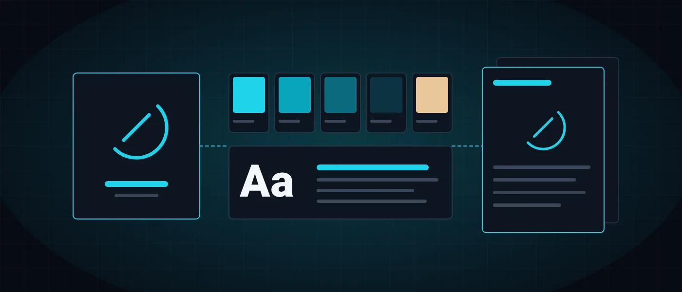
Business branding is one of those terms everyone uses and everyone means differently. Some mean the logo, some mean the colors of the website, and some mean the overall impression the business leaves. In practice branding is all of these together, and above all the decisions behind them.
This guide covers what a branding process actually includes: the difference between a logo and a brand, the stages, what goes into a brand book, when to build around an existing logo and when to replace it, what drives the price and how to choose who does the work. The examples come from projects we delivered at Logicode, a software development company in Haifa that designs brands and also develops their websites and systems.
What is business branding, and how is it different from logo design?
Business branding is the process in which a business defines who it is, who it speaks to and how it differs from competitors, and turns those definitions into one language that repeats wherever a customer meets it. A logo is the mark that identifies the business. A brand is everything the customer remembers and feels after the encounter: the colors, the typeface, the writing style, the website, the business card and the way the phone is answered.
The difference shows as soon as the business grows. With only a logo, every document, post and page looks slightly different, because whoever prepares them is guessing. With a defined identity, everyone who works with the business knows which color a heading uses, which typeface suits long text and what must never be done to the logo. That consistency is what makes a small business look organized and a large one look like a single body.
We describe the service itself on the business branding and UX/UI design page. Here we focus on the process and the decisions.
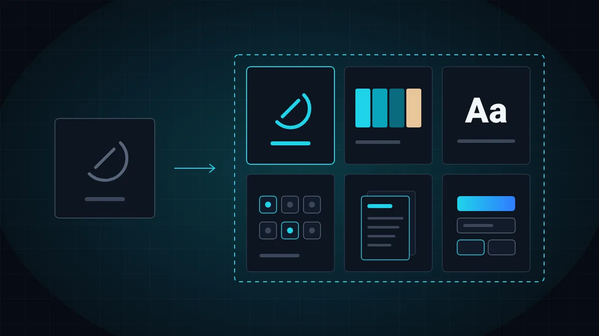
- Logo: the mark and the name, in several versions for different uses.
- Colors: a defined palette with a role for each color.
- Typography: a typeface for headings and one for body text, with a fixed size scale.
- Graphic language: icons, shapes, patterns and a photography or illustration style.
- Verbal voice: how the business writes and speaks, and what it does not say.
- Usage rules: where each component appears and how it is kept intact over time.
What does a branding process include? The stages in order
A good branding process starts with questions, not sketches. Before a single line is drawn you need to understand what the business sells, who its customers are, who the competitors are and how the business wants to be perceived. The answers become a few values and a positioning statement, and every later design decision is tested against them. That way you decide by what serves the brand rather than by personal taste.
After strategy comes the visual identity: mark and logo, colors, typefaces and icons. Several initial directions are usually presented, and they converge into one direction that is approved and refined. Only then is everything documented in a brand book, translated into a design system for the website and app, and applied to the real materials of the business.
The order matters. Whoever starts with applications, for example designing a website before colors and typefaces are defined, finds at the end that every piece looks different and that the work has to be done twice.
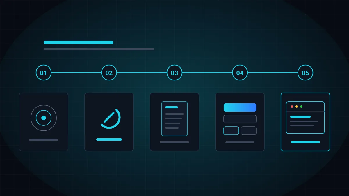
- Strategy: audience, competitors, values, positioning and tone of voice.
- Visual identity: mark, logo, colors, typefaces and icons.
- Brand book: documentation of every decision and rule.
- Design system: interface components for the website and app.
- Application: website, business card, stationery, presentations and social media.
- Ongoing support: new applications and extensions over time.
What goes into a brand book, and how is it different from a design system?
A brand book is the document that explains how to use the identity. It is written for everyone who will work with the brand after the designer is done: the marketer, the print shop, the web developer, and you two years from now. A good brand book answers questions before they are asked: which logo version suits a dark background, what the minimum clear space around it is, and what the smallest size is at which it stays legible.
A design system is the translation of the brand into a digital interface. Instead of pages of explanation it defines components: a button, a form field, a card and an error message, with their colors, spacing and states. When the system is also written in code, what appears in the brand book is exactly what loads on the website, and the brand does not erode on the way from design to development.
In the branding we did for Bat Chen de Paz, an insurance agent, we delivered 15 logo files, 35 signature icons, a brand book in HTML and PDF and a design system from which the website was built. In the branding of The Great Poop Book the brand book has ten chapters and is the basis for the store website.
- Strategy: values, positioning and verbal voice, with wording examples.
- Logo: versions, clear space, minimum size and prohibited uses.
- Colors: exact values for print and screen, and accessible contrast ratios.
- Typography: typefaces, weights and a size scale.
- Graphic language: icons, shapes and patterns.
- Applications: real examples of a business card, a post, a document and a website.
Rebranding, or building around an existing logo?
Not every branding process starts from a blank page. Many businesses have a logo their customers already know, and there is no reason to throw it away. In that case the whole identity can be built around it: you measure the logo, identify the angles, shapes and colors already in it, and turn them into rules.
This is how we worked on the branding of Ayelet Insurance and Finance. We did not change a single line in the logo, and from it we derived three brand values, a palette of blues, a typeface, eight logo versions, 15 icons, a brand book and a design system for the website. For Bat Chen de Paz the logo also stayed as it was: the teal was sampled from its gradient, and the gold was chosen after her surname, Paz, which means fine gold in Hebrew.
Rebranding fits when the logo no longer represents the business: the business changed its field or audience, merged with another, or the logo simply does not work at small sizes and on screens. Even then it is worth keeping what customers recognize, such as a color or a shape, so the familiarity built over years is not lost.
- The logo is known to customers and works well: build around it.
- The logo is good but nothing exists around it: complete a full identity.
- The business changed its field, audience or name: consider rebranding.
- The logo is illegible when small or fails on a dark background: update or replace it.
- Several different versions are in circulation: unify and document them.
How long does branding take, and what drives the price?
There is no single price for business branding, because the scope changes from one business to another. Someone who needs a logo and a business card pays for different work than someone who needs strategy, a brand book, a design system and a website. So ask for a quote that itemizes deliverables rather than a single sum, and compare quotes by what is delivered at the end, not by the bottom line.
The duration also depends on scope, and mostly on the pace of decisions. A clear strategy shortens the design stage, because there is something to test each direction against. What lengthens a process is usually many decision makers, a change of direction midway and feedback that arrives in pieces.
If the branding is part of a website project, plan them together. We wrote about the cost components of a website in how much a website costs, and you can get an initial estimate from the cost calculator.
- Whether strategy is needed, or already exists in writing.
- A new logo, or building around an existing one.
- The number of icons and illustrations to design.
- The depth of the brand book, and whether a design system in code is needed too.
- The number of applications: business card, stationery, presentations, social media and website.
- The number of revision rounds included in the quote.
Common mistakes in branding a business
The most common mistake is starting with the logo. A logo designed without strategy can be beautiful, but it is hard to explain why it is right, and harder still to build a language from it. A close relative is choosing by personal taste: the question is not whether the owner likes green, but whether green serves what the business wants to convey to its customers.
A second mistake is designing only for a large screen. Most encounters with a brand now happen on a phone, at the size of an icon or a profile picture. A logo with thin details or long text disappears there. So every mark is tested at a small size, on dark and light backgrounds and in a single color before it is approved.
A third mistake is forgetting accessibility. A brand color on which text cannot be read creates a problem on every page of the website. Checking contrast at the palette stage saves fixes later, and you can read about the requirements themselves in our guide to website accessibility under Israeli Standard 5568.
- A logo without strategy, which cannot be explained or extended.
- Decisions by personal taste instead of by the target audience.
- A mark that was not tested at a small size and in a single color.
- A palette that was not checked for contrast and accessibility.
- Delivery of one image file, without vector files and without rules.
- A brand book nobody opens, because it has no usage examples.
How do you choose who builds your brand?
Start with the portfolio, and look for process, not only results. A nice logo can be shown in any presentation. What indicates serious work is the explanation: where the color came from, why the typeface was chosen, and how the brand looks on a real website rather than in a mockup. Our branding projects are shown in the portfolio with the full process, from analysis to applications.
A question worth asking early is who implements the brand in digital. In most cases one designer hands over files and another developer has to decipher them, and spacing, weights and colors get lost on the way. When the same team designs and develops, the design system is written from the start so that it can be implemented precisely, quickly and without hurting performance. We wrote about the link between design and conversions in UX/UI psychology, and about choosing a vendor in general in how to choose a software development company.
With us, design and development happen under one roof, done by designers and developers and not by AI, so what is approved in the brand book is what goes live. If you have a logo and no brand, or you are starting from scratch, talk to us and we will work out together what scope fits your business.
- Is a process shown, or only pictures of the result?
- Which files are delivered, and in which formats?
- Does the brand book include usage rules and examples?
- Who implements the brand on the website and in the app?
- How many revision rounds are included, and what happens after them?
- Who owns the rights to the logo and the files at the end of the process?
More articles worth reading
- The Psychology of UX/UI Design for Premium Brands
- How Much Does a Website Cost in 2026?
- How to Choose a Software Development Company in Israel