
Insurance Agent Branding: From a B Symbol to a Complete Design Language
How we took an insurance agent's existing logo and built a full identity from it: colours, typography, signature icons, a verbal voice, a web design system and a brand book, without touching the logo itself.
01. The challengeA good logo standing alone
Bat Chen de Paz is an insurance agent who works with private clients in four areas: life insurance, health insurance, travel insurance and retirement planning. She had an original logo: the letter B drawn as a single ribbon, with an arrow rising out of it, in a teal gradient. What she did not have was everything around it. With no defined colours, no text typeface, no icons and no rules, every new piece of material started from zero.
The brief: build a complete system from the existing logo, so that the website, the business card, the quote and the social post all look like the same agent and sound like her. The logo itself was left unchanged.
02. Symbol analysisWhat the B already says
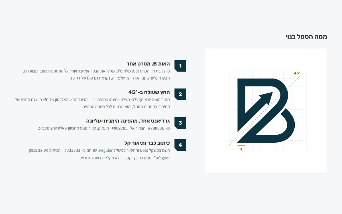
We began by measuring the symbol. The B is built from one ribbon of constant width, which became the brand's unit of measure (X). The upper bowl, together with the straight stroke beside it, also reads as the D of "de Paz". An arrow rising at 45° leaves the letter, and the same angle cuts the bottom of the symbol. The gradient runs from the light #78DEDE to the deep #0097B5, with the light coming from the direction the arrow points to.
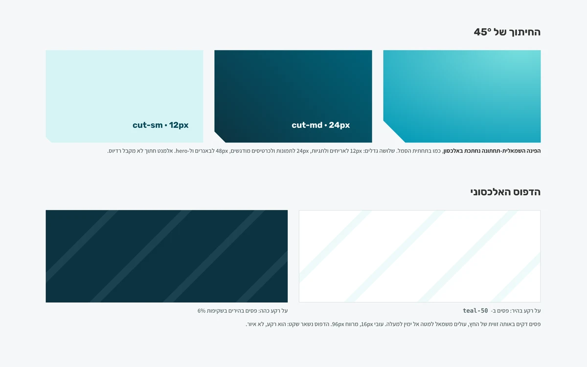
These three findings, the constant width, the 45° angle and the gradient, are the basis for everything that followed. The diagonal cut on the website's buttons, cards and images is the same cut found at the bottom of the symbol.
03. Brand strategyFour values and one voice
The brand promise is written in the logo itself: "personalised insurance and finance". We broke it down into four values that every design and writing decision is checked against.
Personal fit
No off-the-shelf portfolio. Every recommendation is built from the family, the income and the plans of the person in front of Bat Chen.
Clarity
A professional term is explained in one sentence, and a number is shown with its unit.
Guidance
Bat Chen speaks in the first person and stays available after the signature.
Growth
The arrow in the symbol: every meeting ends with the next step.
The verbal voice follows from the values: personal without flattery, professional without talking down, calm without scaring. Bat Chen writes "I check" and not "we provide end-to-end service", and never promises savings or an approved claim. The brand book includes a "write this, not that" table with ready examples.
04. The logo systemThree lockups, five colour versions
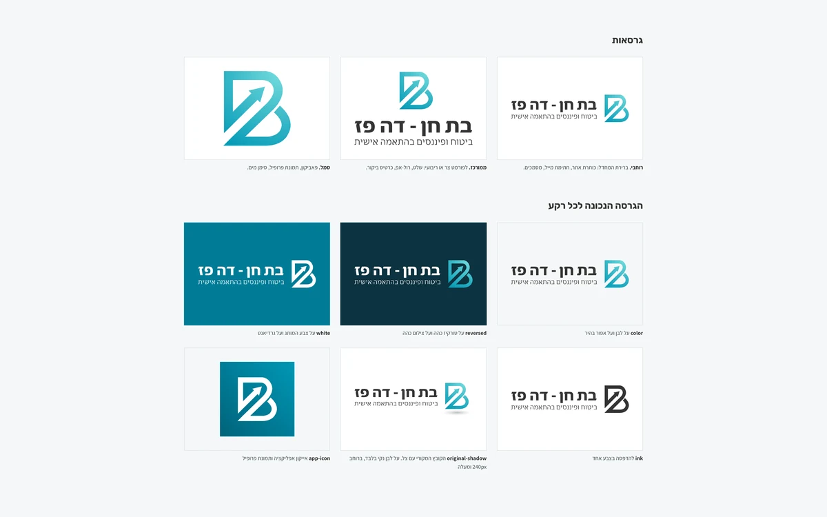
From the original file we produced a full logo system without redrawing it: a horizontal lockup as the default, a stacked lockup for narrow or square formats, and the symbol alone for the favicon and profile picture. The horizontal and stacked lockups exist in five versions: colour, reversed for dark backgrounds, white for the brand colour, ink for one-colour print and the original with its shadow. That makes 15 SVG files, each with a PNG export.
Every version has a defined clear space of 2X on each side, a minimum size (140 pixels for the horizontal lockup, 96 for the stacked one, 24 for the symbol) and six prohibited uses, from stretching to transparency.
05. Colour paletteTeal from the symbol, gold from the name
The two teal tones were sampled from the logo's gradient, and from them we built a ten-step scale. For text and actions we chose a darker tone, #007C97, because the original teal is too light for text on white. Beside it we added a single accent colour: gold, after the name Paz. It appears in small doses, in badges and milestones, and is never used as text on white.
Every text and background pairing in the palette was checked against WCAG 2.1 AA, and the full contrast table is in the brand book, including the pairings that must not be used.
06. TypographyOne typeface for headings, one for reading
The name in the logo is set in FbYaguar and is supplied as a vector file, so it is never retyped. For the rest of the brand we chose two free typefaces: Rubik for headings, whose rounded corners echo the ribbon of the symbol, and Assistant for body text and interface, because it stays readable at small sizes. The type scale is fixed, from a 56-pixel display heading to a 13-pixel caption.
07. Icons and graphic languageIcons that look like the logo
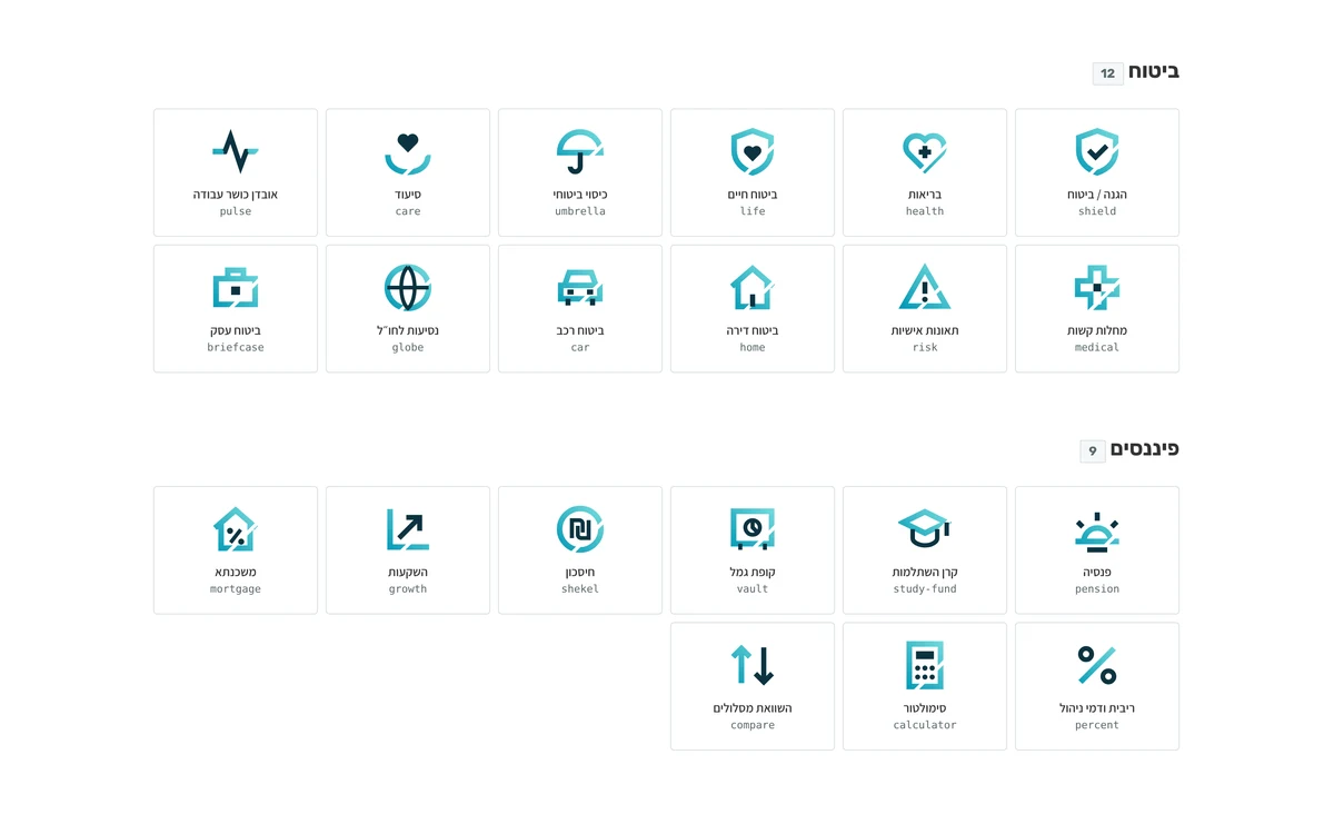
An ordinary line icon set was not enough here. We designed 35 signature icons built like the symbol: a gradient ring cut at 45°, with a dark detail inside. They are grouped into three families, insurance, finance and service, and come with 45 simple line icons for the interface itself.
The whole graphic language rests on the diagonal: a 45° cut on the bottom corner of cards, buttons and images, in three sizes, and a pattern of diagonal stripes for dark and light backgrounds.
08. A design system for the websiteFrom the book to the code
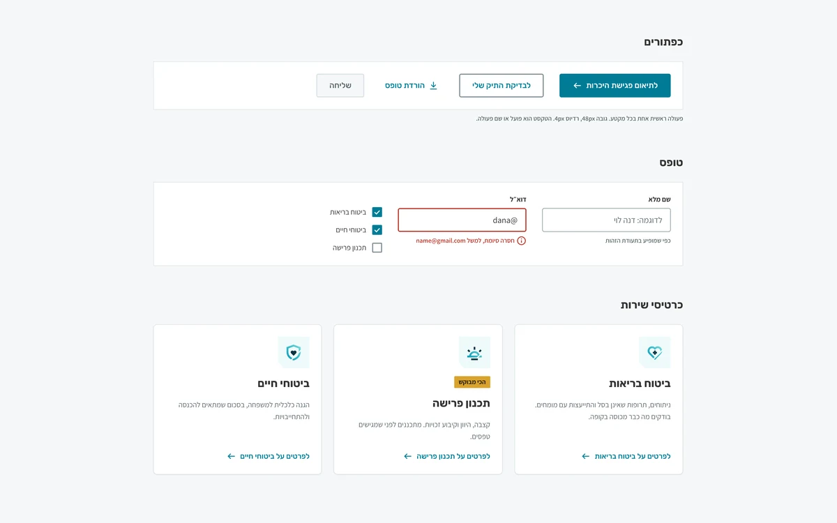
A brand book that stays in a PDF does not build a website. So every decision was translated into tokens: colours in a light and a dark theme, typography, spacing, radius and shadows as CSS variables and as a JSON file. On top of them we built the interface components: buttons, form fields with error states, service cards, badges, alerts and a call-to-action banner.
Every component is built right to left, with a visible keyboard focus and contrast that meets Israeli Standard 5568. Bat Chen's website was built from exactly these components.
09. Real-world applications
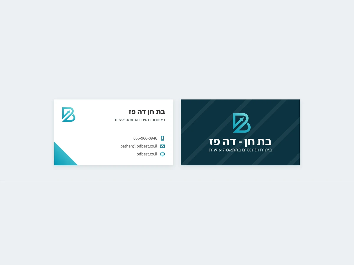
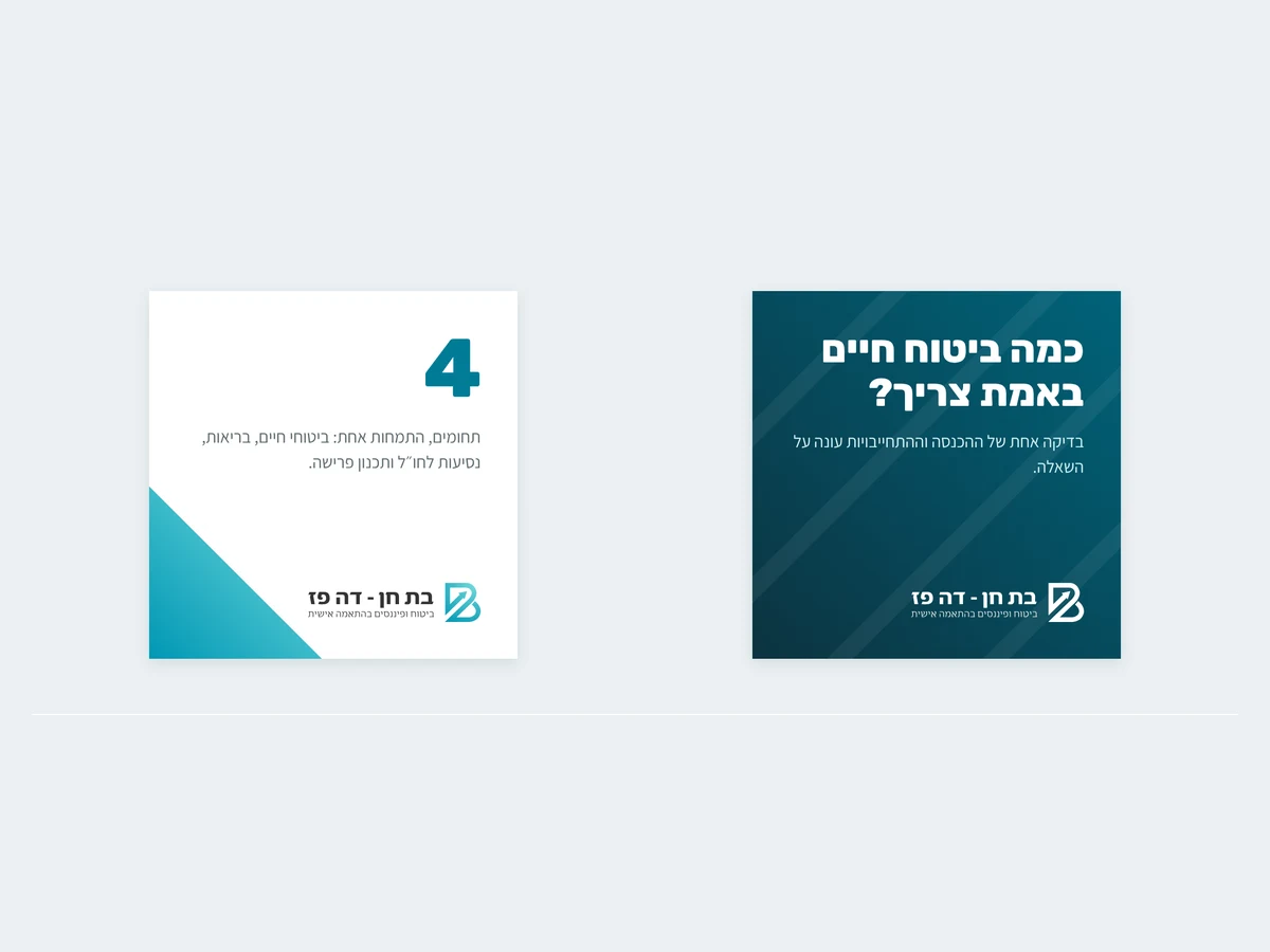
The brand leaves the book for the business card, social media and the website, and stays the same brand in each of them.
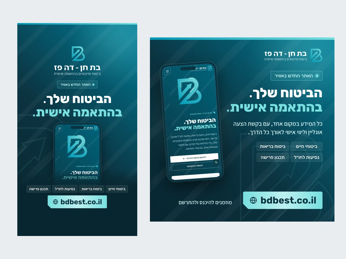
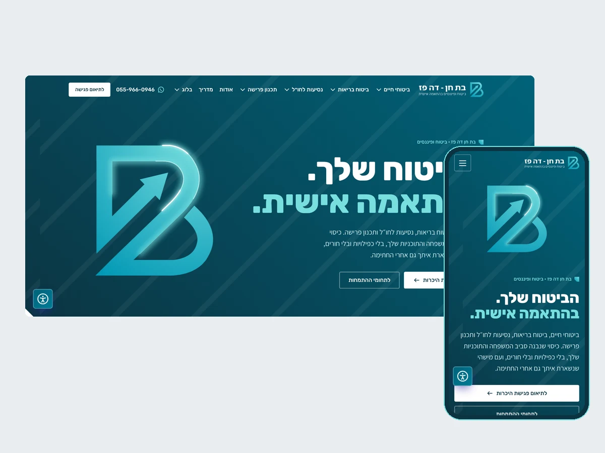
A good logo is a starting point and not a finished product. Measure it seriously and you find that the colours, angles and shapes are already there, and the work is to turn them into rules anyone can follow.View the website built on this branding →
Frequently asked questions about insurance agent branding
What does branding for an independent insurance agent include?
An analysis of the logo, defined values and a verbal voice, a colour palette, typography, icons, a graphic language, a logo version system, applications such as a business card and social templates, and a brand book that gathers the rules. For Bat Chen de Paz we also built a design system in code, from which the website was built.
Can you build full branding without replacing the logo?
Yes. When the logo is good, you build around it. In this project the logo stayed as it was, and the colours, the 45° angle and the shape of the icons were derived from it.
Why design custom icons instead of using a ready-made set?
A ready-made set looks the same for every business that uses it. Bat Chen's signature icons are built like her symbol, a gradient ring cut at 45°, so they are recognised as part of the brand even without the logo beside them.
Where did the gold colour come from?
From the name. Paz means fine gold in Hebrew, so gold is the only accent colour beside the teal. It is used in small doses so that it stays an accent.
In what format was the brand book delivered?
As an HTML page that opens in a browser and as a PDF for printing and sending, together with a file package: logos in SVG and PNG, icons, tokens in CSS and JSON and the components file.